Optimize Your Market Vision with the Turn Area Chart Indicator
Visualizing Price Action is the most critical skill a technical analyst can possess. While standard candlesticks offer a wealth of information, they can sometimes create "chart fatigue," making it difficult to spot the underlying trend amidst high-frequency volatility. The Turn Area Chart indicator is designed to solve this problem by transforming raw price data into a structured, area-based visual system that emphasizes momentum shifts and trend sustainability.
Understanding the Turn Area Chart
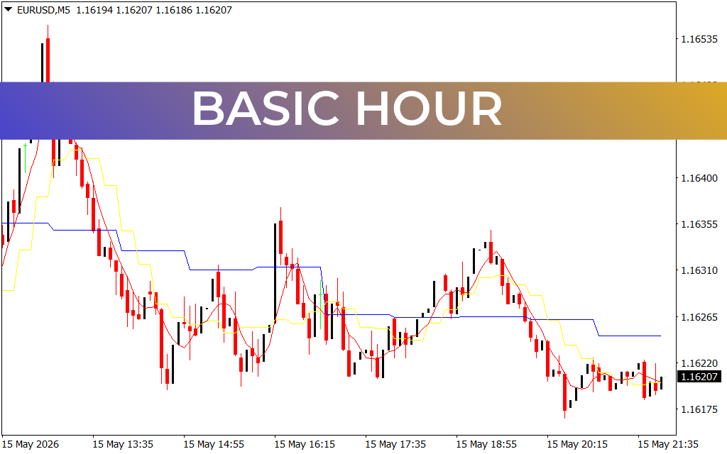
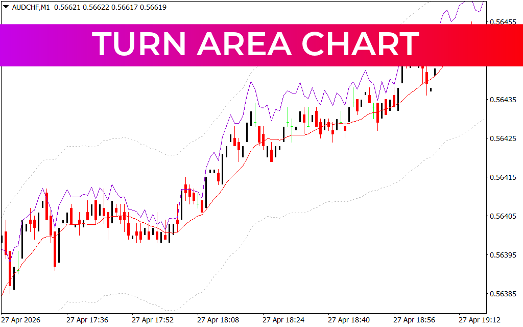
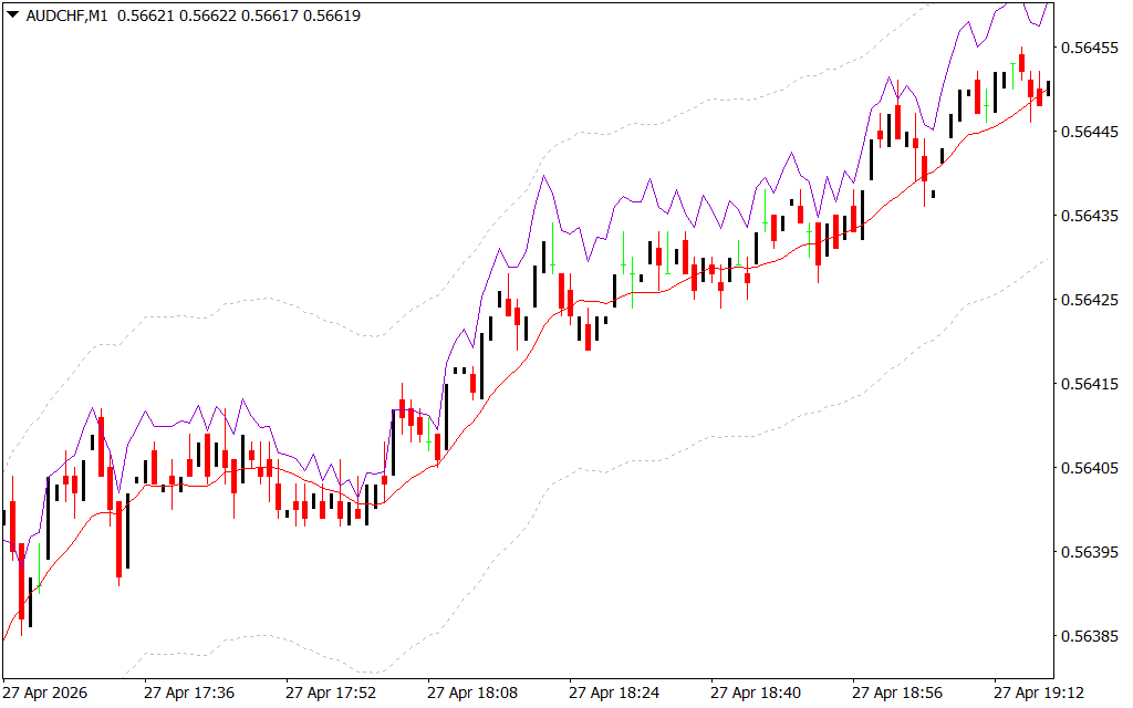
The Turn Area Chart is a sophisticated overlay for MetaTrader that utilizes a combination of moving average envelopes and price-action smoothing. As seen in the AUD/CHF M1 chart, this indicator creates a dynamic "channel" or "area" that tracks the price. By using a median line (typically represented by a weighted moving average) and outer boundary bands, it provides a clear roadmap of where the market is trending and where it is likely to pivot.
Unlike a standard line chart, the Turn Area Chart highlights the "Turn" zones—specific areas where price momentum is exhausted and a reversal is probable. The purple boundary lines act as dynamic resistance and support, expanding and contracting based on current market volatility.
Why the Turn Area Chart is a Game Changer
For scalpers and day traders working on lower timeframes like the M1 or M5, the ability to see the "path of least resistance" is vital. The Turn Area Chart offers several key advantages:
- Noise Reduction: By smoothing out erratic price spikes, the indicator allows you to focus on the core trend. When the price stays pinned toward the upper purple boundary, the bullish momentum is strong and undisputed.
- Dynamic Support And Resistance: Rather than relying on static horizontal lines, the Turn Area Chart provides levels that move with the market. This is particularly effective during strong trending phases where traditional pivot points might be left far behind.
- Volatility Tracking: The width of the area gives an immediate visual cue regarding market volatility. A narrowing area suggests a breakout is imminent, while a wide area indicates a stable, trending environment.
Strategy and Execution
The most effective way to trade with the Turn Area Chart is to look for mean reversion and trend breakouts. In a strong uptrend, traders often look for price to "ride" the upper boundary. If the price pulls back into the central red median line and bounces, it presents a high-probability "buy the dip" entry. Conversely, a sharp break below the entire shaded area indicates a significant trend change, signaling an exit or a potential short position.
By integrating the Turn Area Chart into your trading setup, you transition from guessing market direction to following a mathematically backed visual guide. It simplifies complex price movements, allowing you to trade with more confidence and less emotional interference.
1 Download
Last Update:
Apr 28, 2026 14:00 PM
Published:
Jan 31, 2026 19:59 PM
Category: